Predicting office hours with light sensor data
Lights on, lights off
For the last two years, our office has been utilising a light sensor for tracking opening hours. The sensor just checks the current luminosity in the office and says whether it is open or not. An example excerpt for one day looks like this:
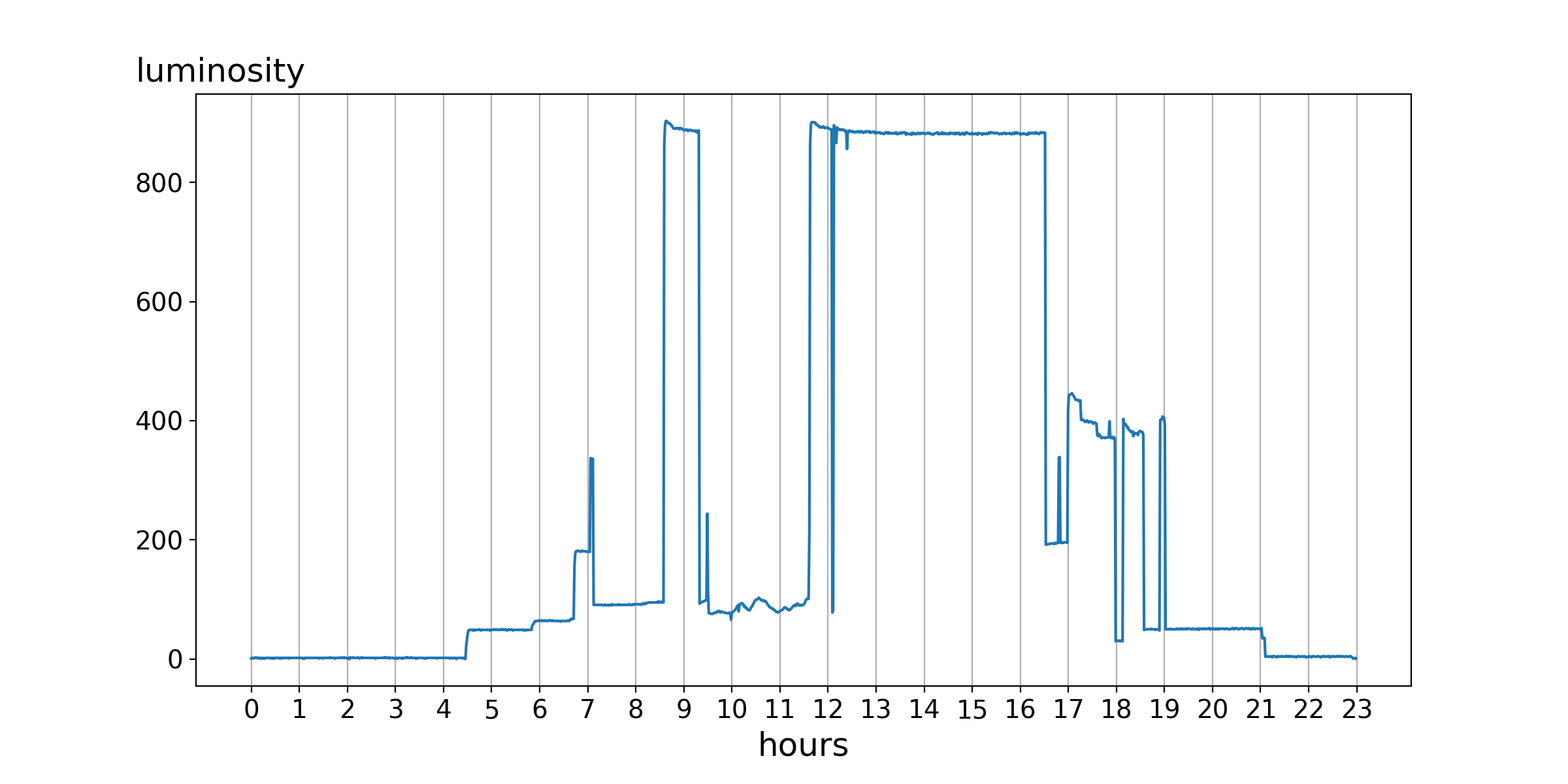
Several things are visible. Apparently, nobody is in the office at night and there is a suspicious gap around 12, aka lunch time. On the other hand, the core opening hours are between 8:30 and 16:30. Additionally one can see the influence of the natural sunlight and the hallway illumination in the early morning and late evening hours.
With this rather descriptive representation it is easy to say whether the office is open or not, but most people do not camp in front of the door and wait until the status changes. People plan their ways before going somewhere (Well, most of them). So for us, it was time to provide some sort of service which can give you a prediction of whether the office will be open in the near future. This would make it possible for people to look up the next time when they can find the office staffed.
Darling leave a light on for me!
As you might have noticed from the first picture, the sensor measures the luminosity on a scale from 0 to 1000 every minute. The higher the value, the more light there is in the room. The office is open if the measured value is over 500. All values over the last two years are stored in database. But how do we get from this static model to a predictive one? I will explain a simple approach which gives feasible results.
The magic word you are looking for is fast Fourier transform (FFT). This very complex algorithm models an arbitrary signal as a collection of base sine functions with specific frequencies and amplitudes (and phases). The Wikipedia page shows a very illustrative example with an animation.
 Given our pandas data frame
 year_data with measures for every minute in 2016, we can now apply numpy’s FFT to it. But before any of this can happen, we need to smooth the data because one point for every minute makes the signal very noisy. There would be no significant base frequencies. For smoothing, I used a rolling mean with a window over 2000 minutes (~1.5 days). Putting all together, we get the following.
import numpy as np
import pandas as pd

# year_data
# | timestamp        | val |
# | ---------------- | --- |
# | 2016-08-01 17:25 | 200 |
# | ...              | ... |

# rolling mean
test_mean = year_data["val"].rolling(window=2000, center=False).mean().fillna(0)

# fft with scaling
fft_data = np.fft.fft(test_mean)
N = len(fft_data)
scaled_fft = 2.0/N * np.abs(fft_data)
The plotted FFT looks like this (capped to max. 400/min).
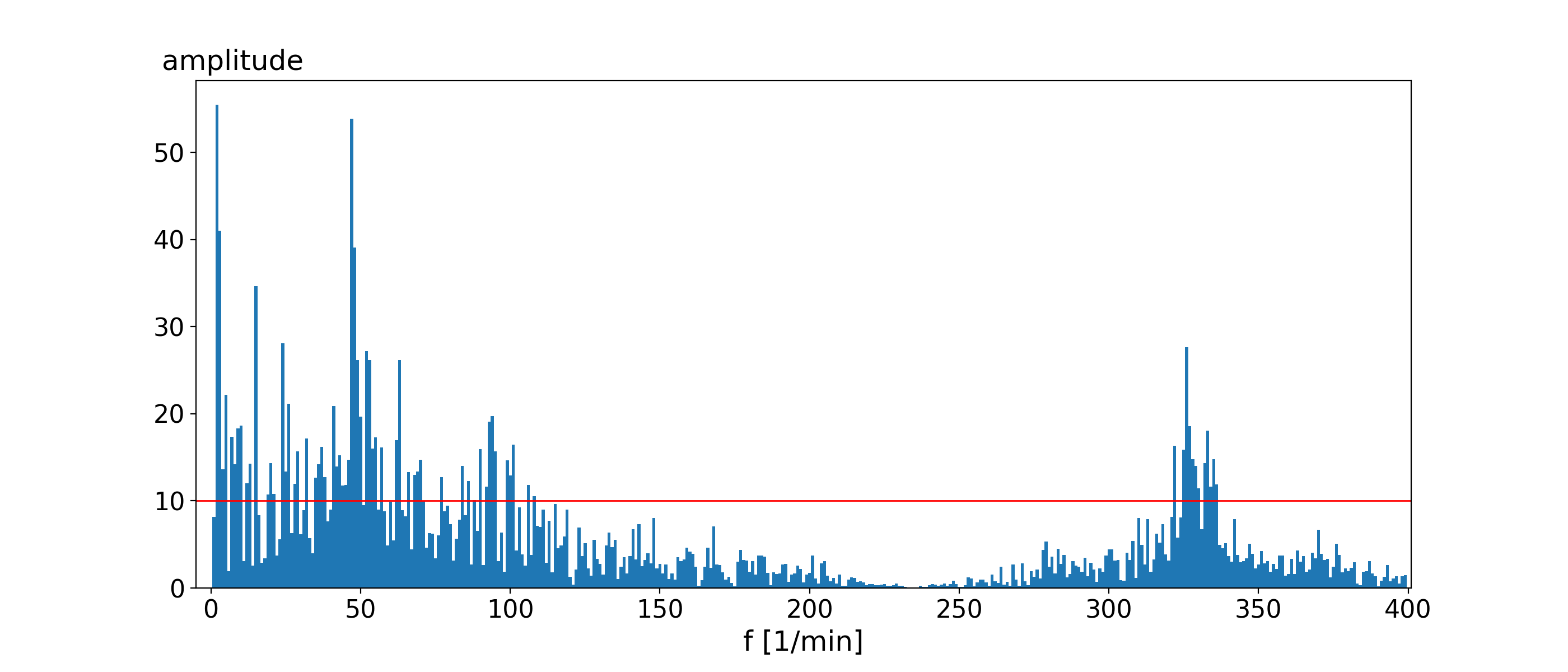
The red line in the image symbolises the idea of a significant frequency. A frequency is significant if it adds more than 10 to the luminosity value (amplitude). With a list of these significant frequencies and amplitudes, we can now model our signal as a sum of sine functions. Every single frequency and amplitude will be used to fill the general equation of a sine wave.
y(x) = amplitude*sin(2.0 * pi * frequency * x)
We will add all significant frequencies to one large function with which we want to predict any value within a year.
# function for one day (the fifth in the year)
T = 24 # predicts per day (once every hour)
start = 4 * 1440 # start in minutes
end = 5 * 1440 # end in minutes
x = np.linspace(start,end,T)
func = np.zeros(len(x))

for f in np.where(scaled_fft > 10)[0]: # significant?
    if f < N//2:
        func = func + scaled_fft[f] * np.sin(2.0 * np.pi * float(f) * x)

func = func + 500
The resulting function models the example day of the first image. Both curves can be put into one image.
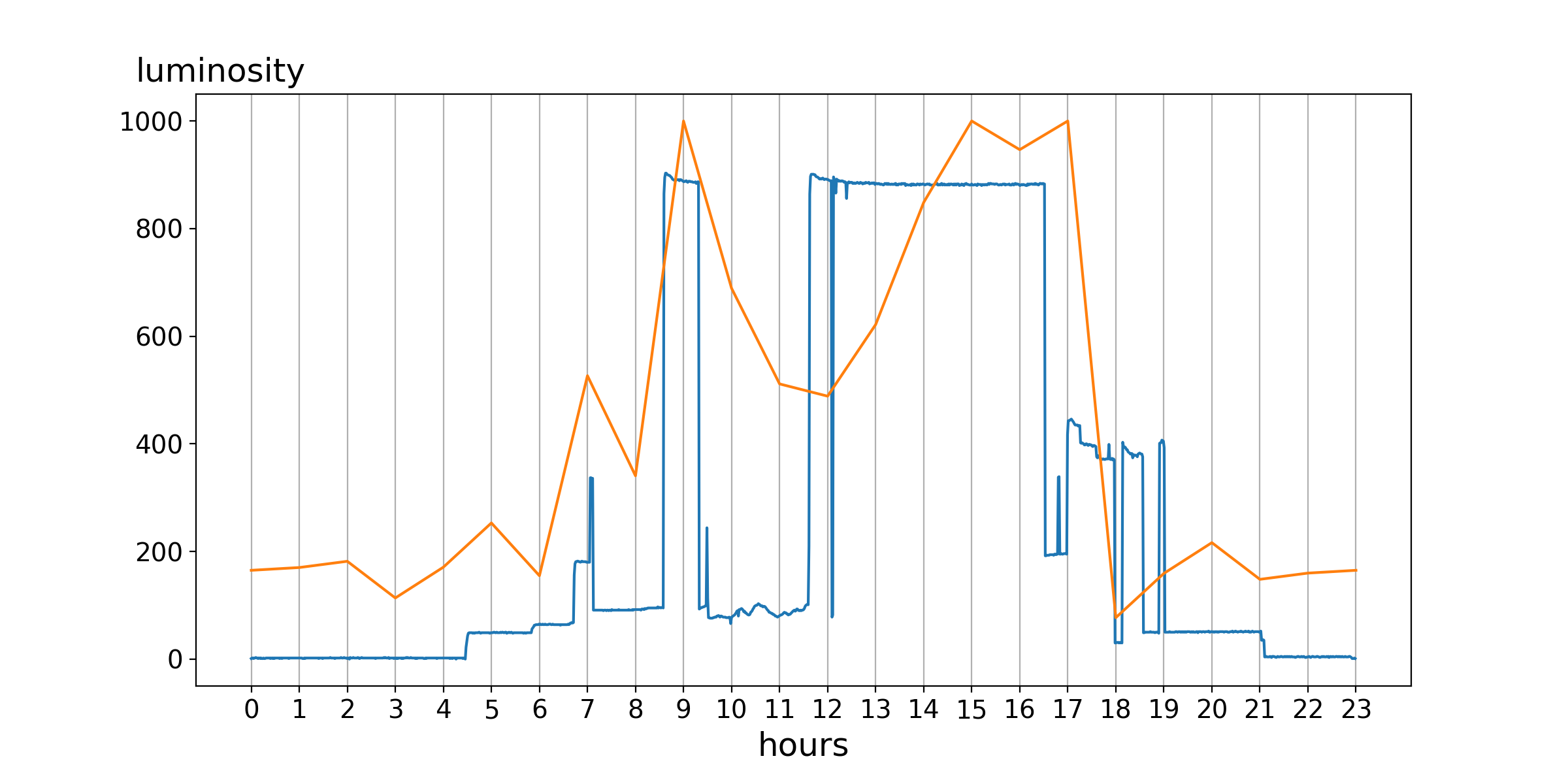 It is clearly visible that the general curvature for both function is nearly the same. At least if you consider the threshold of 500 and therefore only look on the status open/closed.
Note: There are some additional steps done to get this image. Please consider the next chapter for further details.
It is trivial to use this function and generate any point of time in the year. This can also be used to generate points for the next hours and use it as a prediction. So, if you are looking for the status of the next hour at 11:00 on the 1st August, you look at the function value for the 1st August at 12:00. This value divided by 10 gives kind of a probability (no real probability!) of the chance of the office being staffed.
Great, now the lights went off.
You have experienced a simple prediction model. If you are feeling shaky, do not be afraid. This is the predicted behaviour. Please consider that it is very simple. Without any adjustments, it does not model the luminosity value well. Our example uses additional knowledge to enhance the prediction. These are:
- half the probability if it is the weekend,
- double the probability if someone is already in the office,
- divide the probability by three if it is night time,
- divide the probability by three if it is examination time.
This improves the prediction (code) by some margin. It delivers an overall acceptable feeling for the prediction to the user. Naturally, it still has a margin for errors.
And therefore back to Nosferatu, Master of Light.
Other sources and libraries include pandas, numpy and jupyter.