Drinking game - Visualizing recommendations for drinks
Being spoilt for choice
Imagine standing here, at the counter of a refreshment kiosk, looking up at the blackboard with the menu and blowing air through your lips making a sound of desperation. The list of ‘hip’ drinks does not sound like anything to you. The names of the drinks look like hipsters had their cats run over typewriters (Not keyboards! That would be too mainstream). And you just wanted a drink. You thought this was going to be easy. It is not. The clerks are not much help either. They just praise every drink like it is the holy grail. Words like ‘awesome’ and ‘organic’ whirl through the room like a squirrel on speed. You just get fed up with everything and settle for something basic like a soda from a large company. You know that you missed out on what could have been a new experience for your taste buds. You feel unsatisfied and alone. In the distance, sirens. This was the sad tale of the overwhelmed customer.
Every now and then everybody gets this feeling of being overwhelmed by the sheer number of beverage choices available. This can be very irritating if you are ordering refreshments from a kiosk or something similar. But rejoice! Help is on its way (in a way). Wouldn’t it be cool to have some sort of orientation based on your personal taste and some general features of a drink? Especially, if you could just look at a graphic? Great, this is exactly what we trying to do here: Building a visualization of products (in our case beverages) and their properties (flavors). Both groups will be represented by points in a 2D space and their proximity will tell you how similar a product is to all flavors and vice versa. So, next time you look up at the menu, you can find your new favorite beverage intuitively based on your preferences in a 2D graphic.
We asked 100 people if they like answering questions for game shows
First of all, you need data containing some sort of mapping of properties to products. In our case the flavors and their strengths must be mapped to the potables. We focus on these seven properties: sparkling, fruity, sour, refreshing, spicy, sweet and reviving. Each property has a scale of 1 to 10 with one meaning ‘non-existing’ and ten ‘very strong’. To get a measured assessment of all properties, we conducted a survey. Thankfully, we have access to a student-run kiosk/coffee bar in our faculty building. We used this to our advantage and let the bar’s customers fill in a questionnaire rating their purchased beverage. Each product has its own questionnaire (unfortunately, only in German) looking like this.

You can find a description of the survey in the yellow box followed by a rating scale for each of the seven properties. The purchased product to be rated can be found right below the headline. 16 different products were up for rating. We collected 150 questionnaires in total. Every filled questionnaire is put into a table containing the rating from each customer for a specific product. The table looks like this. Note that the entries are not how good the customer thinks the properties are, but how distinctive the flavor is.
| product | sparkling | fruity | sour | refreshing | spicy | sweet | reviving |
|---|---|---|---|---|---|---|---|
| kolle-mate | 3 | 7 | 8 | 7 | 1 | 3 | 10 |
| kolle-mate | 2 | 6 | 10 | 10 | 2 | 1 | 1 |
| zotrine | 8 | 10 | 10 | 7 | 1 | 5 | 1 |
| ... | ... | ... | ... | ... | ... | ... | ... |
To get a contingency table with just one row for each product, we average the scores over each property column grouped by the products. We tried different averaging techniques, but stuck with the geometric mean in the end. An example table could look like the following.
| product | sparkling | fruity | sour | refreshing | spicy | sweet | reviving |
|---|---|---|---|---|---|---|---|
| kolle-mate | 2.5 | 6.5 | 9 | 8.5 | 1.5 | 2 | 5.5 |
| zotrine | 5.5 | 9.3 | 8.4 | 4.5 | 2.6 | 3.75 | 1.0 |
| ... | ... | ... | ... | ... | ... | ... | ... |
One theory for take away, please
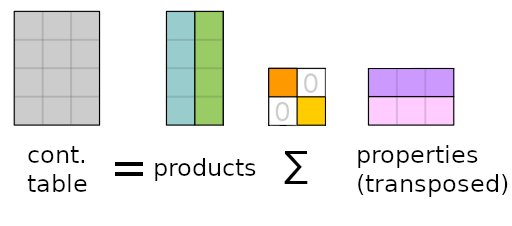
With the data at hand, we can now start to generate a suitable representation for visualization. For this, we used Correspondences analysis (CA). CA uses singular value decomposition (SVD) to transform our 8-dimensional vector space into two 2-dimensional vector spaces, one for products and one for properties. Both vector spaces can be visualized in the same coordinate system. The two vector spaces are the left and right singular vectors of the contingency table’s SVD. Of course, it is not the original contingency table, but a scaled table showing diversion from independence for each value. Here is a graphic, based on the Wikipedia page for SVD, showing a rough estimate on what is really happening.
I will have the … uhm
Enough theory! Let’s see what our algorithm has produced. You will see a 2D scatter plot with two types of points. The red ones show the products and the blue ones are the seven chosen properties. Proximity in the vector space means similarity between two points of one group. Meaning all the mate products conglomerate in one cluster. Same goes for the cola products. So, you can find new recommendations by finding your favorite drink and look at its nearest neighbors. This also works the other way around with the properties. Select a bunch of flavors, you want to experience, and pick the closest product to all of those property points.

Usually, you should not compare two points from one group with points from the other. For example, Flora Mate is technically not less sour than kolle-mate. Of course, we know it is, but this should be interpreted with care. What you can do is to compare one product to all property points to find a general classification for its taste. We have visualized this for kolle-mate.
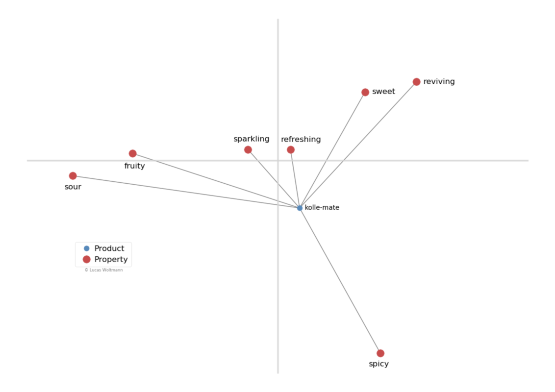
So, if you are looking for a drink which is very refreshing and has good balance between sour and sweet, you would be well-advised to get kolle-mate. This technique also works the other way around. Just pick a flavor and find the closest beverages. This will yield all drinks with a distinctive component for that flavor.
Agree to disagree
Some of you will say that this visualization is not correct because X is much more sweeter or Y has no sour component. Yes, we know. This is an averaged representation of a small group of people. You might experience the drinks differently, but for people just browsing new stuff this can be a good pointer. As ever, opinions can differ. This work only tries to help those who are wandering and being definitely lost.
As a last word, let me summarize the presented work. We
- conducted a survey in the scary and real world of data collection.
- moved some points in the very confusing world of mathematics.
- plotted some points in the frustrating world of data visualization.
Some people seemed to have liked the idea of a 2D recommendation representation. So, the aforementioned student coffee bar has now this offline recommender system on its wall.

What a bunch of geeks (said the geek). And therefore back to Germans, Masters of opening drinks.
Special thanks to the people of ascii for letting me conduct the survey. Built with Jupyter Notebooks and matplotlib.